Using TGauge
Date: 10 March 1997
Author: Brice VIDAL
Platform: 32 bits environement
In memory of: Carcass

Overview
-
Gauges, also
called progress bars, are now widely used thanks to Win95. They
can be used in many cases because of their visual aspect. Most of
the time they are used to show the work that had been done and which is
still to be done but you can use them for whatever you want like showing
a level of available or used resources, displaying the position of a scroll
bar or of a slider bar...
-
The problem with the
TGauge class is that in facts it encapsulates 2 different gauges:
the common one which appeared with Win95 and the one Borland made ages
before Microsoft realized it was a cool stuff. When you use a gauge
you can explicitly use one of the two controls but if you do not want to
bother, there is no problem, the class knows what it has to do. You can
download the code here, it is completely documented
so do not hesitate.
The difference between the gauge controls
-
The native control
(the one from Win95) can only be horizontal so if you use a vertical
gauge, you know it is an emulated control. In the same way,
when displaying text into a solid gauge, you are using the emulated
one. Yet another lack to the common control: invoking the methods to change
the color and the aspect of the gauge may *NOT* be effective if OWL
uses the Common Control support instead of emulating the control. That's
the main differences (the others are in the implementation of the class
TGauge and that's Borland's problem, not yours). Why do you have to know
all this ? Because when you create a dialog using Resource Workshop
you have to make a little change to the code generated in order to have
everything work fine when not using the native progress bar.
The line generated looks like this:
CONTROL "Progress1",
IDC_PROGRESS1, "msctls_progress32",
WS_CHILD
| WS_VISIBLE | WS_BORDER, 50, 30,
80, 20
and you have to change it to this:
CONTROL "Progress1",
IDC_PROGRESS1, "OWL_Gauge",
WS_CHILD
| WS_VISIBLE | WS_BORDER, 50, 30,
80, 20.
-
There are several
ways to make sure you are using the emulated control. The easiest
way is to create a TGauge that can't use anything else than the
emulated control. Any way to make sure you are not using the native control
simply create your gauge object as you whish and invoke the method SetNativeUse().
The parameter is a TNativeUse which can take several values: nuNever
which specifies that the native control should never been used, nuAvoid
which means that the use of the native control should be avoided unless
options require the use of it, nuDontCare which leads to use whatever
is best, nuAttempt will try to use the native control unless options
aren't supported and nuAlways which forces the use of the native
control. The other valuse of the TNativeUse enum can't be used because
they are used to determine if the native control is used or not... Most
of the time you will need to use the emulated control. Here's an example
of a phantom emulated gauge.
#include <owl/gauge.h>
TGauge gauge(0, 0,
0);
gauge.SetNativeUse(nuNever);
Creating a gauge object
-
The TGauge
class is derived from TControl. There are three different
constructors. The first one is the most complete one. The fist parameter
is a TWindow* which is the control's parent. The next parameter
is a const char far* which represents the string to be formatted
and then updated into the gauge. It is formatted in the same way you format
the strings with the sprintf() funtion and sequels. Then we have
5 ints wich respectively represent the id, upper left X-absis, upper
left Y-absis, weidth and heigth of the control. The next parameter is a
bool which determines wether the gauge is horizontal or not. Then an
int sets the margin value between the bevel and the graphic. The
last parameter is a TModule*. This constructor is the one to use
when you want a custom gauge control. As the other constructors it sets
the range from 0 to 100, an increase value of 10,
and a value of 0. But with this one the led spacing and
thickness are set to 0 which leads to a solid bar. The tw2 other
constructors will create a common gauge with a led spaing of 10
and a led thickness of 90. The second csontructor is a simplified
version of the previous constructor. With this one too the first parameter
is a TWindow* representing the parent, then there are the 5 ints
and finally the TModule*. The last constructor which is very simple
is the constructor for a resource gauge object. It only needs a TWindow*
pointing to the parent, an int representing the id of the gauge
and a TModule*.
#include <owl/gauge.h>
TGauge firstKind(0,
"My Gauge value: %d", 0,
50, 90, 80,
25, true, 5);
TGauge secondKind(0,
1, 50, 60,
80, 20);
TGauge thirdKind(0,
IDC_PROGRESS1);
-
Now what you
have to know is that with the common control none of the great functions
such as changing color, etc will work, not even setting a margin.
If you don't need them that's fine but if you want them you need to to
call SetNativeUse() with the parameter nuNever and now you
can do whatever you want with your gauge.
Working with your gauge
The gauge class is able
to display different gauges type. You can change the color of the gauge,
the orientation, the style, the led size...
-
First of all you need
to know if you want a margin, because the only way to have a margin
is to call it in the constructor. If need you cant get the range
of a gauge by calling GetRange() with 2 ints: the first
one will contain the minimum value and the other one, the
maximum value. To know the amont increased by the gauge the
function GetStep() returns an int representing the desired
value. The last thing of the control you can get is the current value.
This value is returned as an int by GetValue(). Here's a
simple example.
#include <owl/gauge.h>
TGauge gauge(0, "My
Gauge value: %d", 0, 50,
90, 80, 25,
true, 5);
int min, max, step, value;
gauge.GetRange(min, max);
step = gauge.GetStep();
value = gauge.GetValue();
-
To change your control's
range call SetRange() with 2 ints: the first one representing
the minimum value and the other one, the maximum value.
In the same way you can call SetStep() with an int to define
the step value. To change the gauge orientation you have to call SetHorizontal()
with a bool, if you create your gauge with the complete constructor,
it is useless but if you use the resource constructor with a vertical gauge
you will have to call it with the parameter false. To specify wether you
want a solid bar or a led bar, or to change the led size, you call SetLed()
which takes 2 ints: the first one represents the spacing
between the leds and the other one the thickness percentage.
If you want a solid gauge, call it with 2 0. To change the color of the
led or of the solid bar just call SetColor() with a const TColor.
Here's a simple example.
#include <owl/color.h>
#include <owl/gauge.h>
TGauge gauge(0, 0,
0);
gauge.SetHorizontal(false);
gauge.SetRange(0,
1000);
gauge.SetStep(100);
gauge.SetLed(20,
80);
gauge.SetColor(TColor::LtBlue);
-
The function SetValue()
called with an int defines the current value, DeltaValue()
which is called with an int will add the value of the int to the
current value so if the int is negative then it will decrease the value.
To increase the gauge value of the defined step value, simply call StepIt()
or use the operator++. Here's a simple example.
#include <owl/gauge.h>
TGauge gauge(0, 0,
0);
gauge.SetValue(50);
gauge.DeltaValue(-5);
gauge.StepIt();

That's all you need to
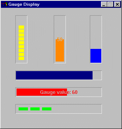
know about gauges. If you want the code that has generated the above image,
download the file which contains all the code here.
It's just a little preview of what you can do with gauges. As an after
word I just recommand to use the OWL gauge, you can do plenty of
things with this one, and then call SetNativeUse() with nuNever
to make sure you are using the right one.
We are waiting for Borland
to create tomorrows visual controls, meanwhile be creative!


